Solidarna Molod
ievgeniiaporoshenko@gmail.com Behance:
behance.net/ievgeniiaa Linkedin:
linkedin.com/in/ievgeniia-poroshenko/
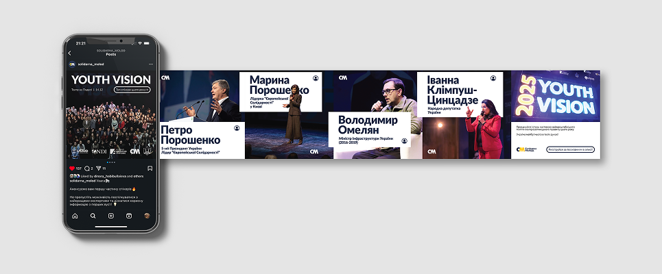
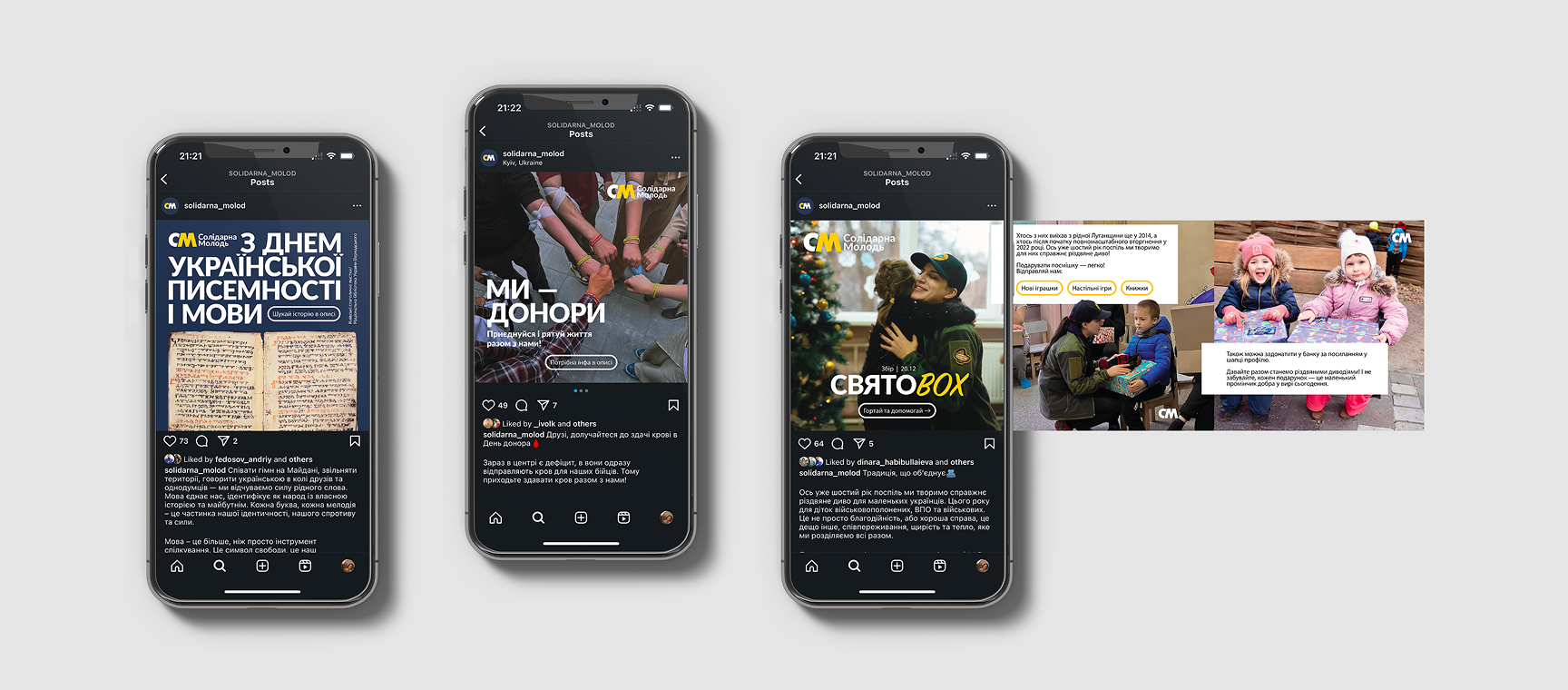
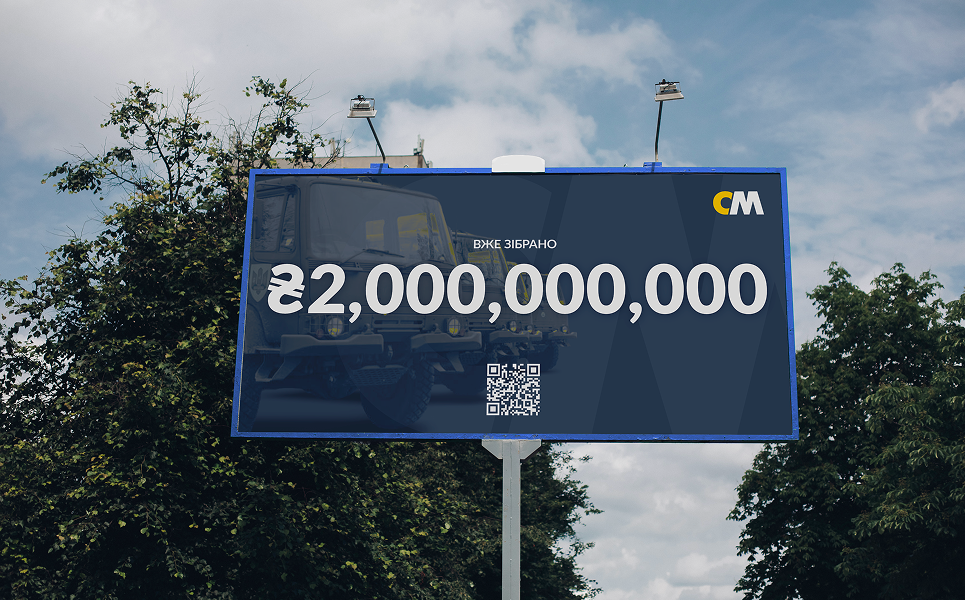
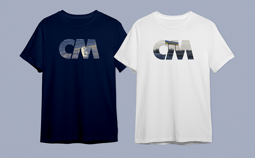
Solidarna Molod is a youth wing of the pro-European Ukrainian party "European Solidarity". It's mission is to educate young people, give them a boost in their political endeavours and making their voices heard.
The challenge was to create an identity that is going to stay relevant to the younger generations, yet true to the main party's brand.
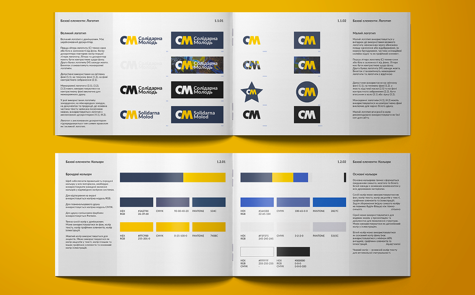
Rebranding includes full brand guidelines.
.png)
.png)
.png)