Diieva
Diieva (Ukrainian: дієва — "actionable", in the feminine form) believes that every success story begins with an action.
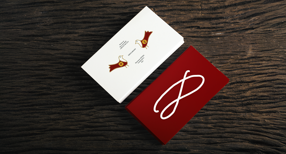
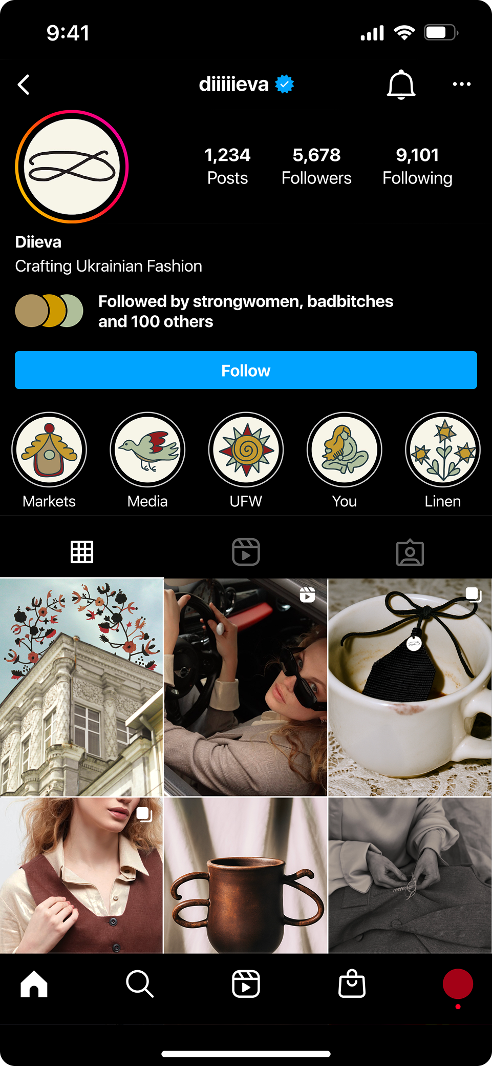
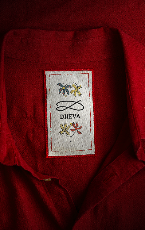
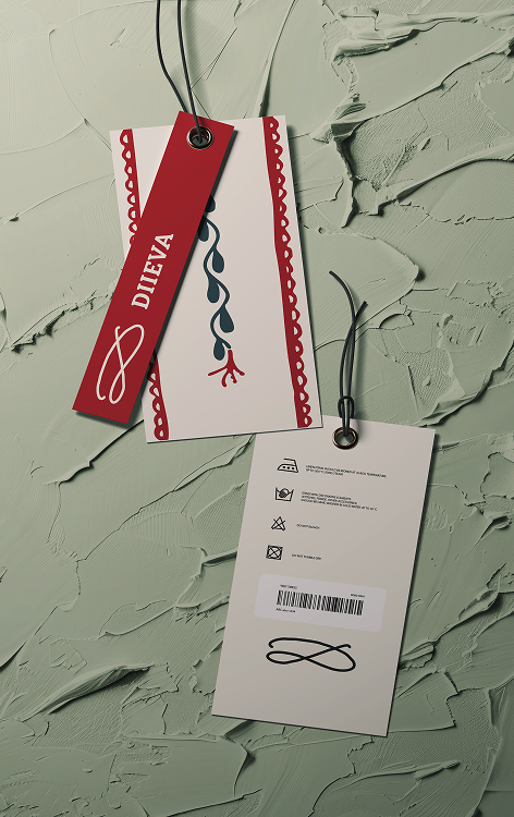
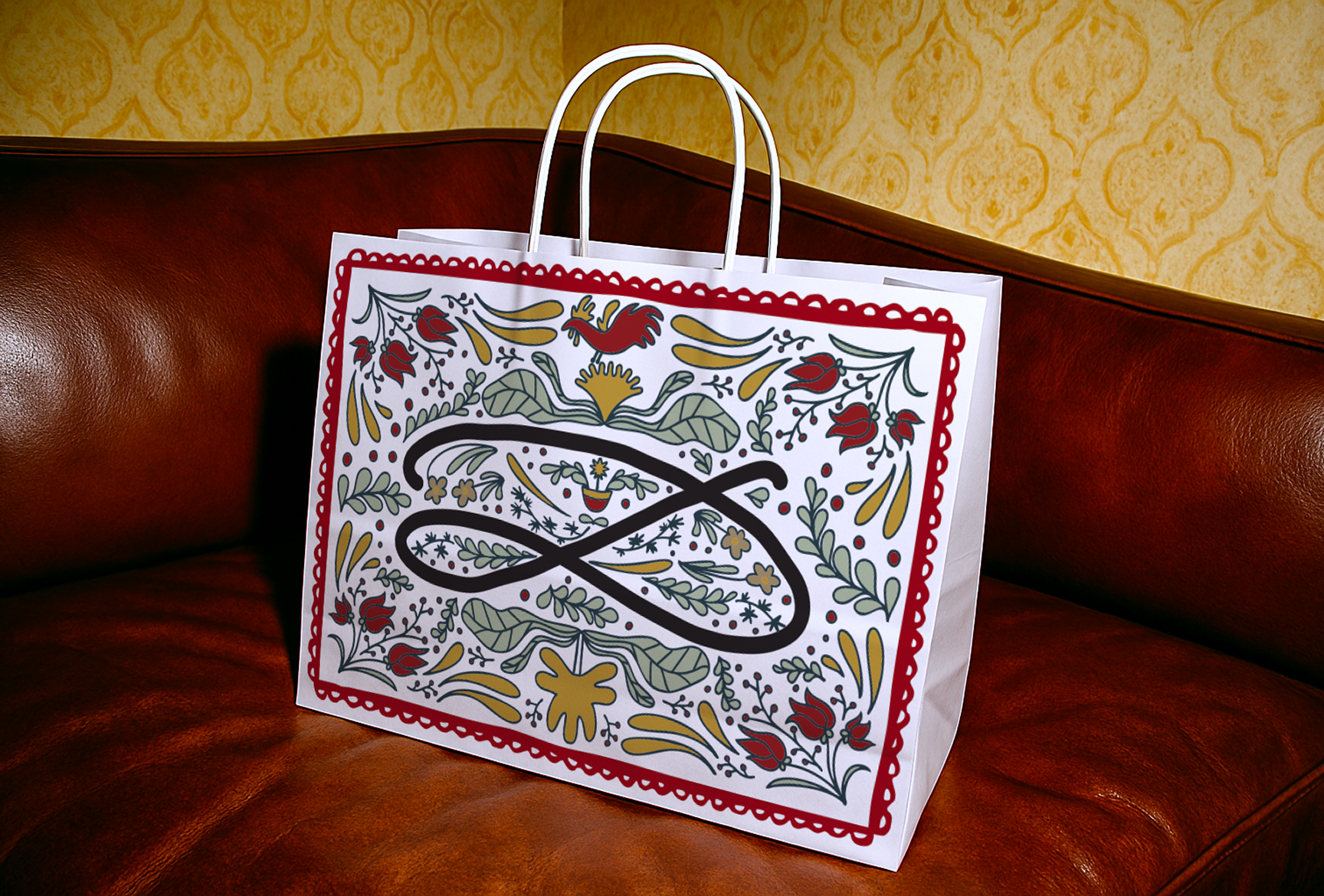
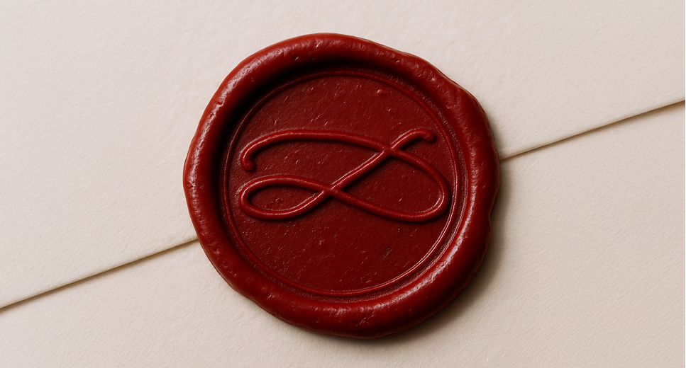
A signature logo, naïve illustrations, and a handcrafted feel across every brand touchpoint form the foundation for inspiring busy women to reconnect with their creative expression.
ievgeniiaporoshenko@gmail.com Behance:
behance.net/ievgeniiaa Linkedin:
linkedin.com/in/ievgeniia-poroshenko/
Diieva is a fashion brand centred around women empowerment.
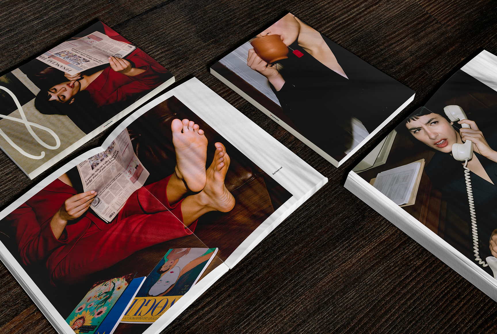
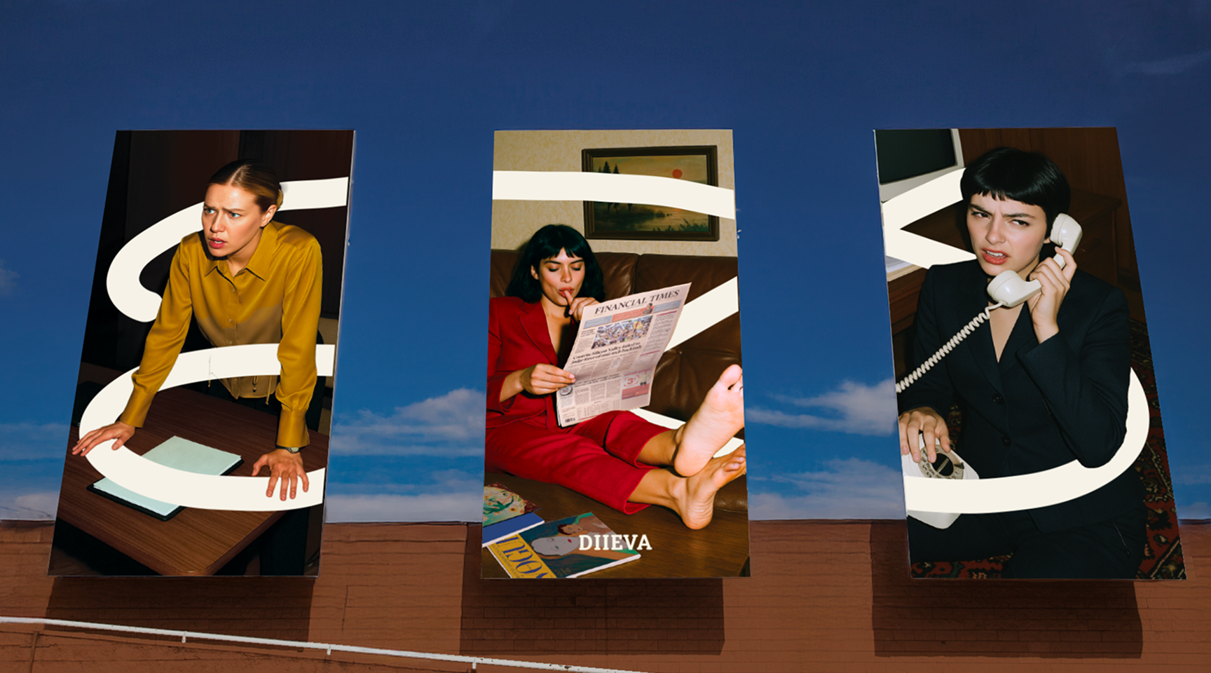
The challenge was to tap into femininity and redefine it as a force of creation and creativity.
The new identity tells a story. One where women are strong and human. Where they feel annoyed and joyful and careless. Where expectations of others do not define them.
Diieva (Ukrainian: дієва — "actionable", in the feminine form) believes that every success story begins with an action.
A signature logo, naïve illustrations, and a handcrafted feel across every brand touchpoint form the foundation for inspiring busy women to reconnect with their creative expression.